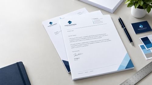
How to Create a Professional Business Letterhead for Print
A professional letterhead helps businesses present a consistent identity across letters, quotations, formal correspondence and other business documents. Good business letterhead printing starts with a clear layout, a suitable logo, accurate contact details and artwork prepared correctly for the intended print format.
Whether you are creating a letterhead for a small business, a consultancy or an established company, the design should make important information easy to find without distracting from the message. This guide explains what to include, how to organise the layout and what to consider before sending your design for printing.
What Is a Business Letterhead?
A business letterhead is a printed or digital document layout that identifies a business through elements such as its logo, name and contact information. It usually appears at the top of a letter and may include additional branding in the footer.
A well-designed letterhead gives business correspondence a consistent appearance while leaving enough space for the main message. It can be used for formal letters, client communications, quotations and other documents where a business identity is appropriate.
1. Decide What Your Letterhead Should Include
Before creating the design, decide which details readers need to identify your business and contact you.
Most business letterheads may include:
- Business name: Use the correct name and make it easy to read.
- Logo: Include a clear version of your existing business logo.
- Contact details: Add the relevant telephone number, email address or website.
- Business address: Include a postal or registered address when appropriate.
- Company information: Add registration or other required details only where applicable.
- Branding elements: Use consistent colours, typography and graphic elements.
You do not need to place every possible detail on the page. Too much information can make a letterhead cluttered and reduce the space available for correspondence.
Choose the information that suits your business and the documents you intend to send. Check all spelling, telephone numbers, email addresses and website details before approving the artwork.
2. Choose a Clear, Professional Layout
The layout determines how the logo, business details and letter content work together. A simple design is often easier to use across different types of correspondence.
Header placement
The top of the page is a natural place for the business logo and name. You can align the logo to the left, centre it or use another balanced arrangement that suits your brand.
Keep the header compact enough to leave sufficient space for the letter itself. A large logo or oversized banner may look impressive in a design preview but leave too little room for the message.
Footer placement
A footer can hold secondary information, such as contact details or a website address. It is useful when you want a clean header and prefer to keep supporting details separate from the main content.
Make sure footer text remains legible and does not sit too close to the page edge.
White space and readability
White space is the empty area around design elements. It helps separate the branding from the letter content and makes the document easier to read.
Avoid filling every available space with decorative shapes, multiple colours or unnecessary information. The letterhead should support the correspondence rather than compete with it.
3. Use Your Logo and Brand Colours Consistently
Your letterhead should look like part of the same brand as your other business stationery.
Use the correct logo artwork rather than recreating it from a low-quality screenshot. If a vector version is available, it can be useful for producing clean results at different sizes. Suitable high-resolution raster artwork may also work, depending on the design and print requirements.
Choose colours that reflect your existing brand identity. If the business already uses specific colours on its business cards, envelopes or other materials, reuse them consistently where appropriate.
Keep colour contrast in mind. Pale text on a light background can be difficult to read, while small, intricate logo details may lose clarity when reproduced at a small size.
For a professional result, check the logo at its intended printed size and review any thin lines, small text and fine details before approving the design.
4. Choose the Right Letterhead Size
For many UK business documents, A4 is the practical starting point because it is commonly used for everyday office correspondence.
An A4 sheet measures 210 × 297 mm. However, the correct format for your project depends on how the letterhead will be used and the requirements of your printer.
Before finalising the design, consider:
- The paper size required for your documents.
- The space needed for the letter text and any address block.
- The placement of logos, headers and footers.
- The margins needed for comfortable reading and printing.
- Whether the document will be printed professionally, in-house or both.
If the letterhead will be used in office printers as well as professionally printed, consider how the design will behave with the available printable area. Some office printers cannot print all the way to the edge of the sheet.
Confirm the final dimensions and any artwork requirements with your chosen printer before exporting the file.
5. Prepare Your Letterhead Artwork for Printing
A good design needs correctly prepared artwork to produce a reliable printed result. Before submitting the file, review the following points.
Check the document dimensions
Set up the artwork at the intended finished size. Do not rely on resizing a design at the last moment, as this can affect text, image quality and layout.
Use suitable image quality
Images and logos should remain clear at their final printed size. Avoid enlarging small, low-resolution images because they can appear blurred or pixelated.
Vector artwork is often a useful option for logos and other graphic elements, provided the file is exported and supplied in an accepted format.
Review fonts and text
Check that the text is legible, the font choices are consistent and all details are correct. If your design software supports font embedding or converting text to outlines, follow the printer’s instructions for the supplied file format.
Check margins and bleed
Keep important text and logos safely inside the page edges. If the design includes a background or graphic that must extend to the edge of the finished sheet, ask whether bleed is required and use the printer’s specified settings.
Do not assume every letterhead requires bleed. The need depends on the artwork and the printing process.
Export in the requested format
PDF is commonly used for print-ready artwork, but requirements vary. Check the accepted file format, colour settings, bleed requirements and any other specifications before submitting the design.
6. Select Paper and Finishing Carefully
Paper choice influences how a letterhead feels, looks and performs during everyday use.
When choosing paper, consider the document’s purpose, the impression you want to create and whether the sheet will be used in office printers. A paper suitable for professional correspondence may not necessarily be suitable for every printer or copying process.
Before choosing a stock, consider:
- Weight: The paper should suit the intended use and handling.
- Surface: A smooth surface can suit clean text and logo reproduction.
- Colour: Choose a paper colour that works with the design and brand colours.
- Compatibility: If sheets will pass through office printers, check that the paper is appropriate for the equipment.
You should also consider whether additional finishing is necessary. For many everyday letterheads, a straightforward paper specification is sufficient. The best choice depends on practical use rather than adding finishes simply for appearance.
Ask your printer for available paper options and confirm any compatibility requirements before placing an order.
7. Avoid Common Business Letterhead Design Mistakes
Several common mistakes can make a letterhead harder to read or less suitable for printing.
Using a low-quality logo: A blurry logo can undermine the appearance of the entire document. Use suitable original artwork whenever possible.
Adding too much information: Too many contact details, decorative elements and graphics can make the page feel crowded.
Using very small text: Contact information should remain readable at the finished size.
Ignoring print margins: Elements positioned too close to the edges may be difficult to print consistently.
Forgetting to proofread: Incorrect email addresses, phone numbers and business details can make printed stationery unusable.
Skipping the final proof: Review the exported artwork, not just the editable design. Confirm the layout, spelling, dimensions and colours before approving it.
A final checklist helps catch these problems before the file goes to print.
8. How to Order Professionally Printed Letterheads
Once your design is ready, confirm the printer’s requirements and review the order details.
A simple process is:
- Finalise the letterhead layout and business details.
- Confirm the finished paper size and suitable paper options.
- Prepare the artwork according to the printer’s specifications.
- Submit the file and review any proof supplied.
- Check the quantity, final design and order details before approval.
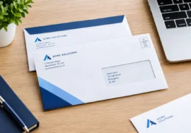
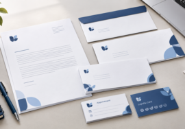
If you need other printed materials, consider how your letterhead will work alongside your business cards, envelopes and compliment slips. Consistent typography, colours and logo placement can help create a coordinated stationery set.
Explore the relevant stationery categories on the iFix Prints website to identify materials that may suit your business communication needs.
Final Checklist for Print-Ready Business Letterheads
Before approving your business letterhead printing, check that:
- The business name and contact details are correct.
- The correct logo is used and looks clear at its final size.
- The layout is uncluttered and leaves room for correspondence.
- The document dimensions match the intended paper size.
- Text and important graphics sit within safe margins.
- Image quality and font handling are suitable for the output.
- Bleed is included if required by the design and printer.
- The exported file meets the printer’s requirements.
- The final proof has been reviewed carefully.
Conclusion
Creating a professional business letterhead for print involves more than placing a logo at the top of a page. The strongest designs combine accurate business information, a clear layout, consistent branding and artwork prepared for the intended printing process.
Before ordering, check the paper size, image quality, margins and printer specifications, then review the final proof. A well-prepared letterhead can help your everyday correspondence look consistent with the rest of your business stationery.
If you are planning a coordinated stationery set, explore letterheads alongside business cards, envelopes and compliment slips to see which printed materials are relevant to your business.
Frequently Asked Questions
1. What should a business letterhead include?
A business letterhead commonly includes the business name, logo and relevant contact details. Depending on the business and the purpose of the document, it may also include an address, website or applicable company information. Keep the layout uncluttered and make sure all details are accurate before sending the artwork to print.
2. What size is a business letterhead?
A4, measuring 210 × 297 mm, is a common choice for UK business correspondence. However, the right size depends on how the document will be used and the printer’s requirements. Confirm the finished dimensions before preparing your artwork.
3. How do I prepare a letterhead for printing?
Set up the document at the correct finished size, use suitable-quality logo artwork, proofread the content and keep important elements within safe margins. Include bleed only where required, then export the file in the format requested by your printer. Review the final proof before approving the order.
4. Should a business letterhead include a logo?
A logo can help readers recognise the business and maintain consistency with other branded materials. Use a clear version of the correct logo and size it so that it supports the document without dominating the page. A simple layout is generally easier to read and use for everyday correspondence.
5. What paper should I choose for printed letterheads?
Choose paper based on the intended use, appearance and printing requirements. Consider paper weight, surface, colour and compatibility with any office printers that will be used. Ask the printer about available stocks and suitability rather than assuming that one paper type is right for every application.
6. Can I use the same letterhead design for digital documents and print?
Often, yes, but the design may need adjustments for different uses. A printed version must meet the printer’s requirements, while a digital document may need to work with office software and electronic sharing. Check dimensions, margins, logo quality and readability in both formats before using the design.
7. What should I check before ordering business letterhead printing?
Check the business details, logo quality, finished size, paper choice, margins and exported artwork. Confirm the printer’s file requirements and review the final proof. If you are ordering matching stationery, also check that the letterhead’s colours and branding are consistent with the other materials.